ExoClick adds new metrics and combo charts to its customizable Dashboard widgets
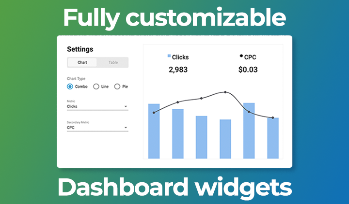
10 June 2020, Barcelona. ExoClick, the innovative advertising company, today announced that it has added a large range of data dimensions and metrics to the customizable Dashboard widgets within their admin panel. The dimensions and metric combinations allow Advertisers and Publishers to display their real-time data as trend overviews using either tables, line or pie charts or a new combo chart that allows clients to plot a combination bar and line chart using two metrics.
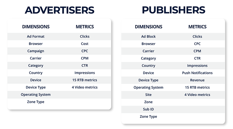
Available dimensions and metrics are:
Clients can customise up to 6 different widgets and the different dimensions can be selected from each widget’s drop down dialog box. The client can then select to display the data as a table or a chart: pie, line or combo chart.
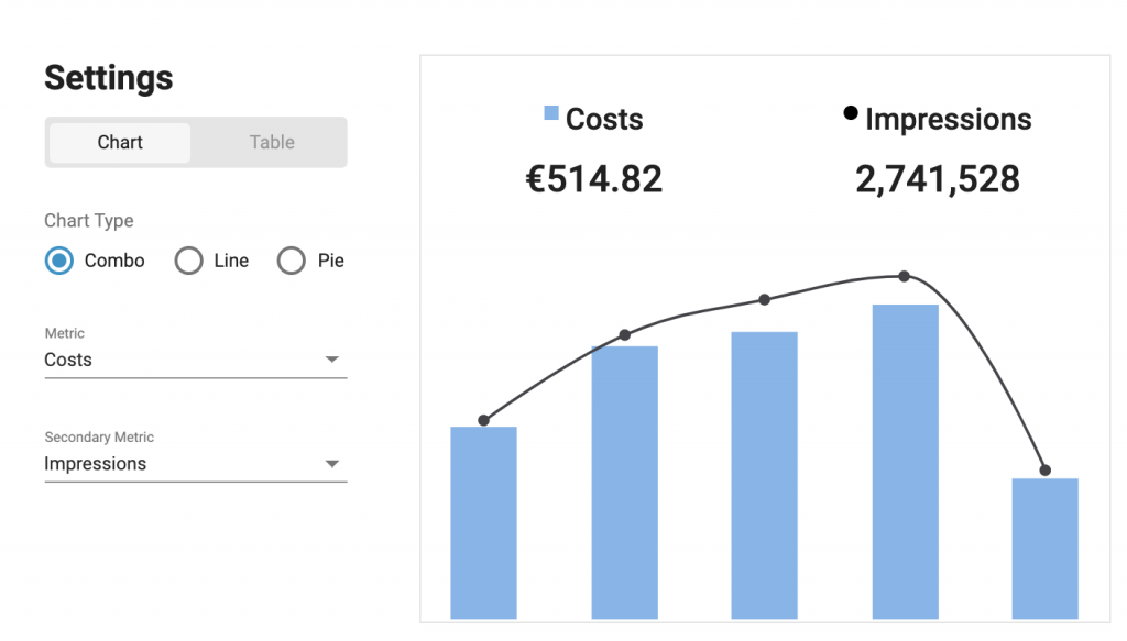
Here is an example of an advertiser combo chart using Costs & Impressions as the metrics:
ExoClick’s Sales and Ad Operations Director Evan Zirdelis commented, “No other ad network offers such flexibility for Advertisers and Publishers to have such an in depth, real-time overview of their data. By adding this large range of dimensions and metrics and easy to view tables and charts, clients are able to use a nearly unlimited combination for data analysation. Additionally, being able to assign different dimensions to different widgets, Advertisers and Publishers are given maximum flexibility when setting up their custom dashboards, allowing them to get at-a-glance insights into almost any aspect of their data.”
More information and a video tutorial can be seen here.