Publishers! 3 different ways to set up your Native Ad Zones
Creating a native ad zone is simple and yet powerfully customizable. You are able to use slightly different processes for setting up a Native Ad zone depending on your needs:
#1 – You simply want to set up a responsive ad zone, and choose the aspect ratio of the native ad zone’s images.
#2 – You want to set up the ad zone to match a custom image size or ratio, so that the ad zone looks the same as your site and fits in perfectly.
#3 – You have a zone on your site of a specific size and want to create an ad zone that fits in it and looks good.
Whichever scenario you choose, the first thing you need to do is to create a Native ad zone.
Please note: Advertisers get better conversions if you allow the Title and Description texts, which brings greater value to your Native ad zones!
Creating a Native Ad Zone
When logged in as a Publisher, click on Sites & Zones, New Zone, and expand the Native section, select one of the Native Ad formats (Recommendation, Interstitial or Exit) and click Next.
Fill out the zone details and click Next.
Scenario #1: Quick Layout: Set aspect ratio
In this scenario, you set the aspect ratio for the images in the Admin Panel, and there is no need to set the total ad zone size . When using the Quick Layout, the ad zone you create is responsive and will adapt itself automatically to the size of the container you place it in.
Step 1:

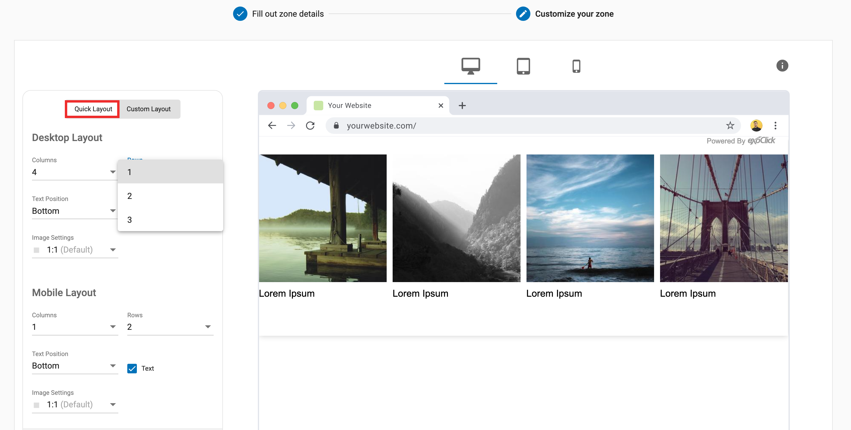
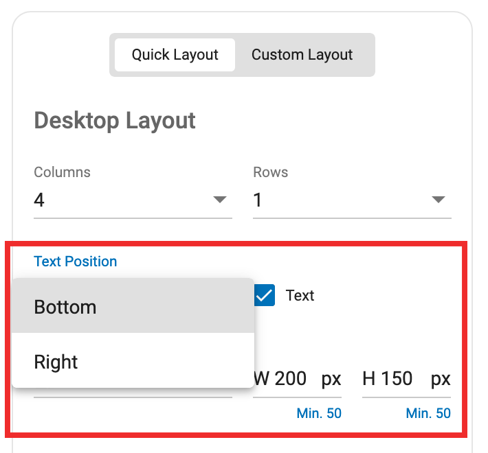
Select the Quick Layout tab. In the Desktop Layout section, set the number of columns and rows of ads you want on desktop.
Step 2:
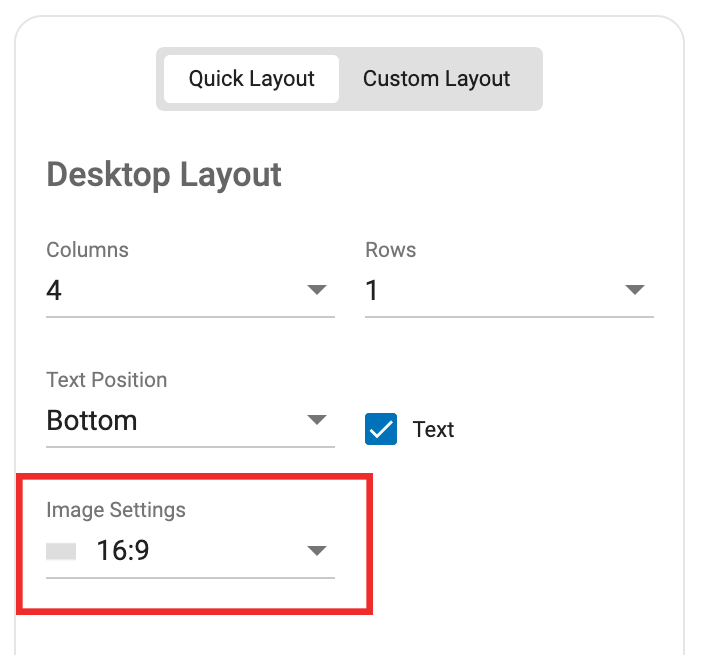
Next, choose the aspect ratio for your images from the Image Settings drop-down. You can choose between 1:1, 4:3 or 16:9 to match the ratio of the thumbnails on your site.
Step 3:
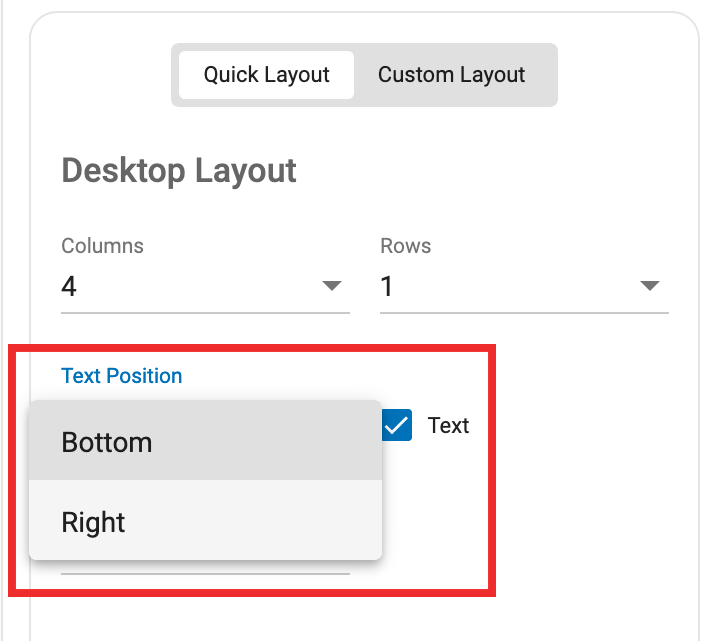
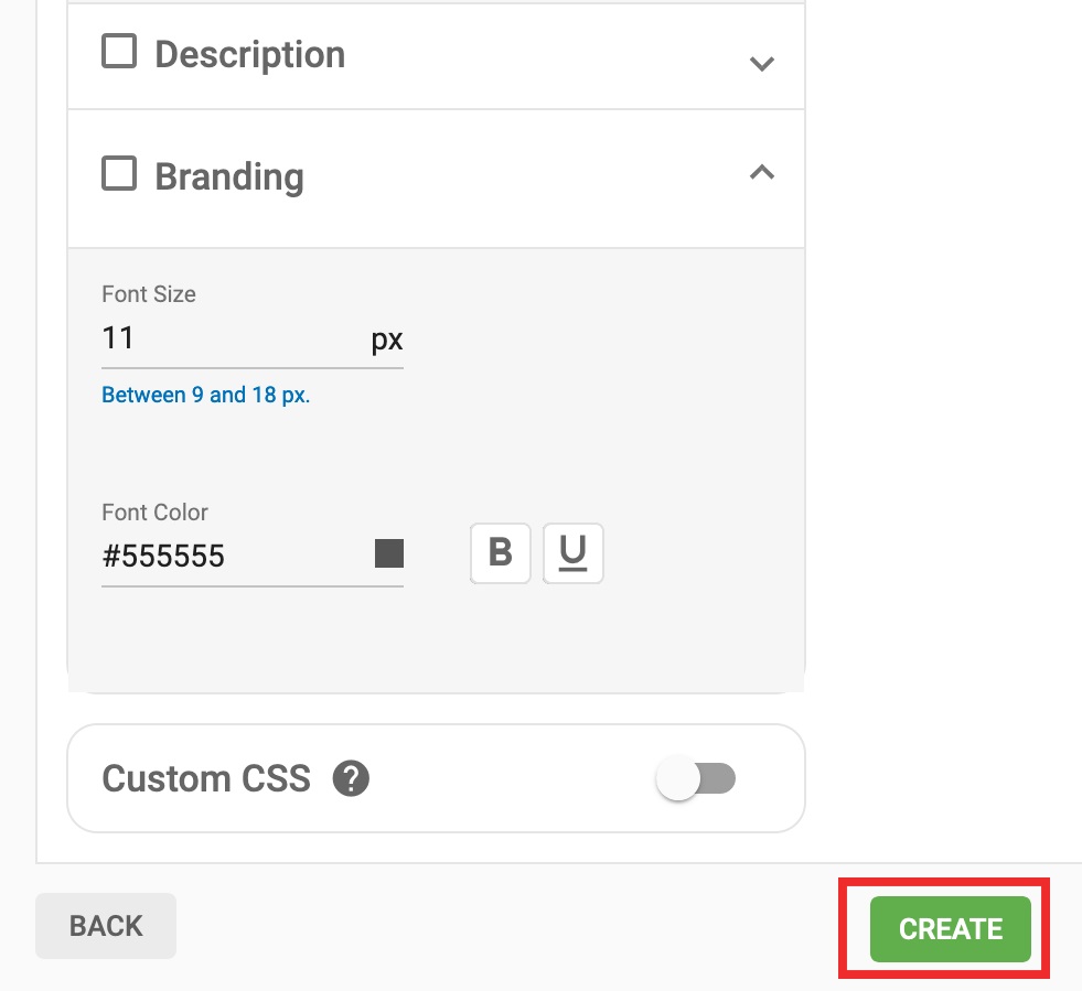
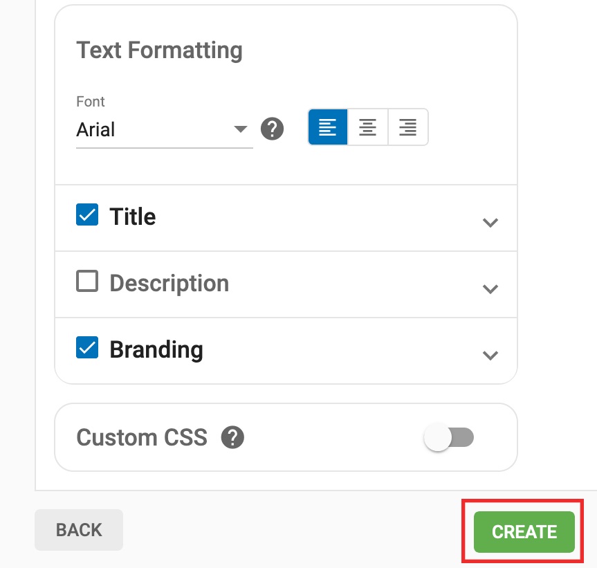
Once you have chosen the aspect ratio, use the checkbox to choose whether you want to show text or not, and then decide where it shows. This text consists of a Title and a Description. You can turn those on and off individually in the Title and Description sections if you wish.
Check the preview on the right to see how your ad zone looks, and tweak the settings again if necessary.
Step 4:
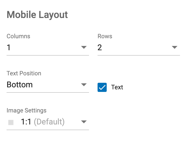
Repeat steps 1-3 above in the Mobile Layout section to set your ad zone up for mobile.
Step 5:
Check the preview for both Desktop and Mobile on the right side of the screen. You can set where the breakpoint between desktop and mobile view occurs in the Mobile Breaking Point drop-down of Advanced Options.
The breakpoint can be set to 800px for tablet, 450px for mobile and Unresponsive. When we change the breakpoint this changes whether our settings in the Desktop Layout section affect desktop and tablet, or just desktop itself.
When you’re happy with how the preview looks, click Create.
Step 6:
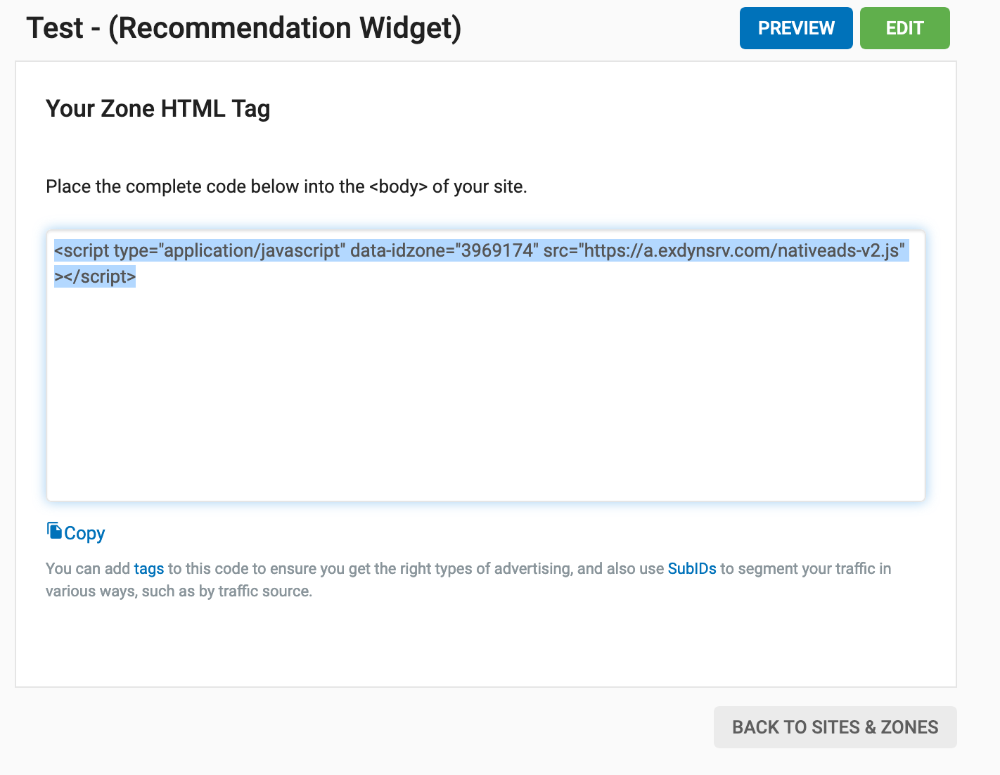
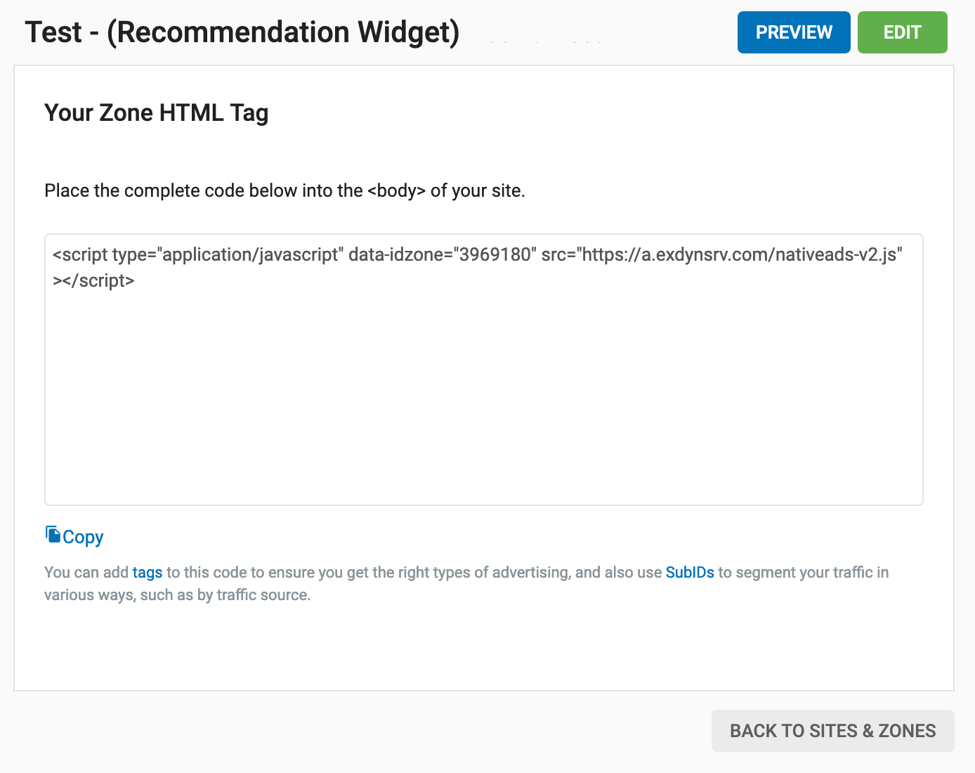
Copy the Zone HTML Tag and add it to your site.
The ad zone will automatically adjust to 100% of the container that you put the tag into. i.e. the larger the container, the larger both the zone and the ads will be.
Scenario #2: Quick Layout: Set a custom image size
In this scenario, you want to be able to change the image size and the spacing of the ad to match your site. You would do this if you really want the Native ads to look like they are part of the editorial content of your site.
Step 1:
Select the Quick Layout tab. In the Desktop Layout section, set the number of columns and rows of ads you want on desktop.
Step 2:
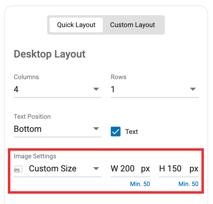
In the Image Settings drop-down, select Custom Size and set the width and height of the images to match your site. If the site contains a meta tag and is responsive, when the site is viewed, the images will respond also as the screen size decreases. Information about the Widget Size and the Image Size will display in the top right corner above the preview.
Step 3:
Once you have set the image size, choose whether you want to show text or not, using the Text checkbox, and choose where it shows.
Check the preview on the right to see how your ad zone looks, and tweak the settings again if necessary.
Step 4:
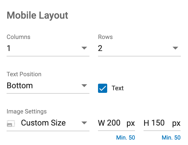
Repeat steps 1-3 in the Mobile Layout section to set your ad zone up for mobile.
Step 5:
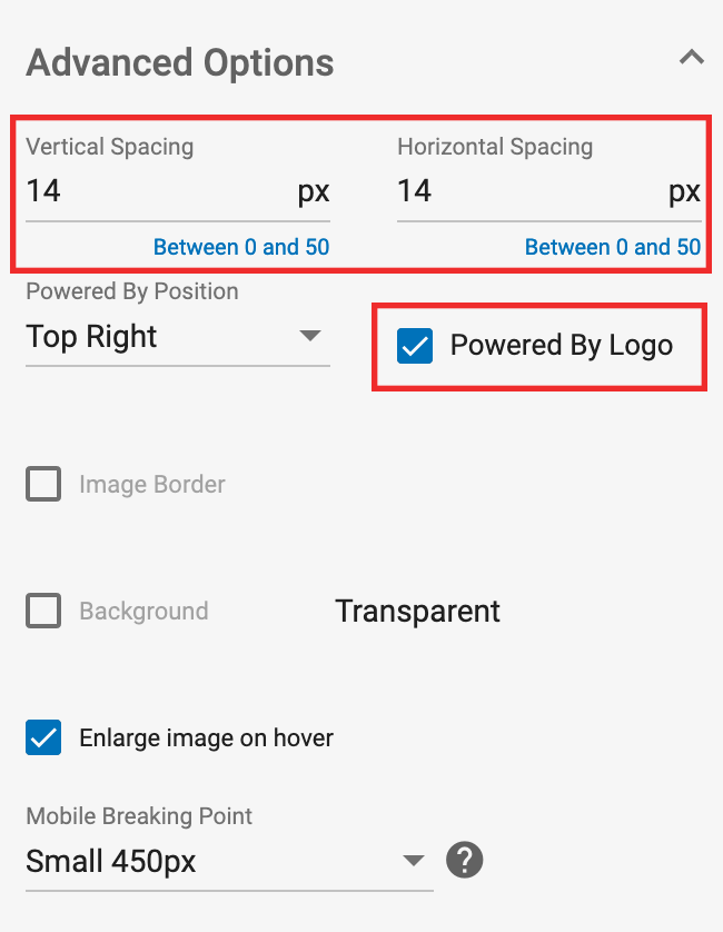
In the Advanced Options section, you can set how many pixels of Vertical Spacing and Horizontal Spacing you want around each ad, and you can also turn on and off the Powered by Logo and choose where it appears. Please note: Changing these settings will change the overall size of the ad zone.
Step 6:
Check the preview for both Desktop and Mobile on the right side of the screen. You can set where the breakpoint between desktop and mobile view occurs in the Mobile Breaking Point drop-down of Advanced Options.
The breakpoint can be set to 800px for iPad, 450px for mobile and Unresponsive. When we change the breakpoint this changes whether our settings in the Desktop Layout section affect desktop and ipad, or just desktop itself.
When you’re happy with how the preview looks, click Create.
Step 7:

Copy the Zone HTML Tag and add it to your site.
Ensure that the ad zone size on your site matches the size of the zone that you just created.
Scenario #3: Custom Layout: Fixed Zone Size
In this scenario, you want to be able to set the size of the ad zone to match what your site needs, and tweak the settings to ensure that the ads display well.
Step 1:
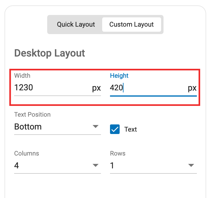
Select the Custom Layout tab. In the Desktop Layout section, set the Width and the Height of the total Ad Zone which you wish to create.
Step 2:
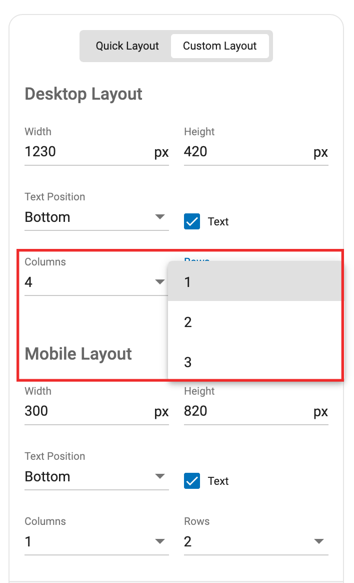
Next, choose how many Columns and Rows of ads you wish to display in the ad zone. Check the preview on the right to see what settings work for the size you have chosen.
Step 3:
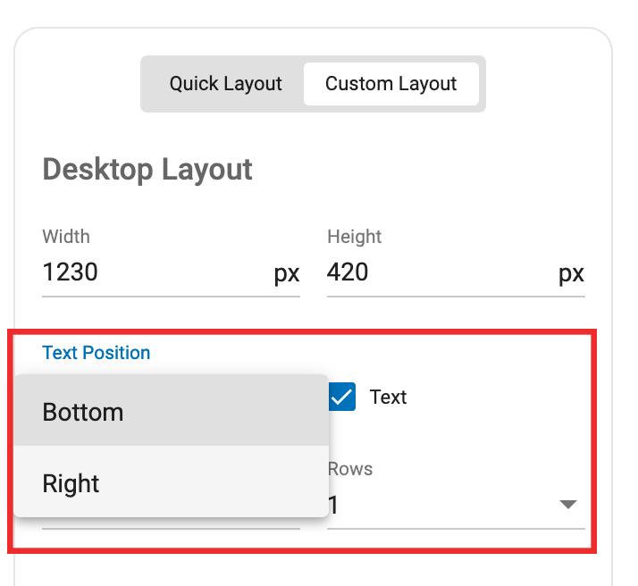
Once you’ve chosen how many columns and rows you want, choose whether you want to show text or not, using the Text checkbox, and choose where it shows using the Text Position drop-down.
Step 4:
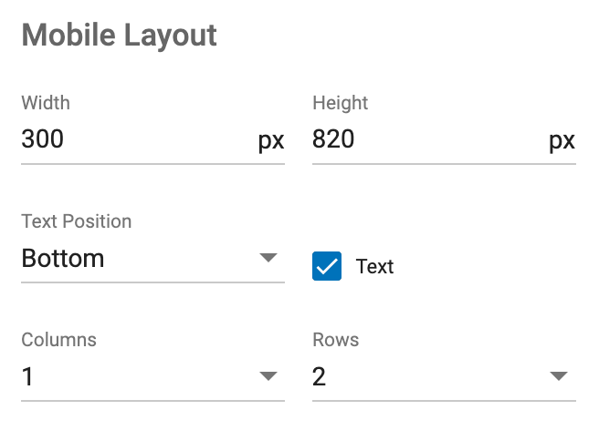
Repeat steps 1-3 in the Mobile Layout section to set your ad zone up for mobile.
Step 5:
Check the preview for both Desktop and Mobile on the right side of the screen. You can set where the breakpoint between desktop and mobile view occurs in the Mobile Breaking Point drop-down of Advanced Options.
The breakpoint can be set to 800px for iPad, 450px for mobile and Unresponsive. When we change the breakpoint this changes whether our settings in the Desktop Layout section affect desktop and ipad, or just desktop itself.
When you’re happy with how the preview looks, click Create.
Step 6:
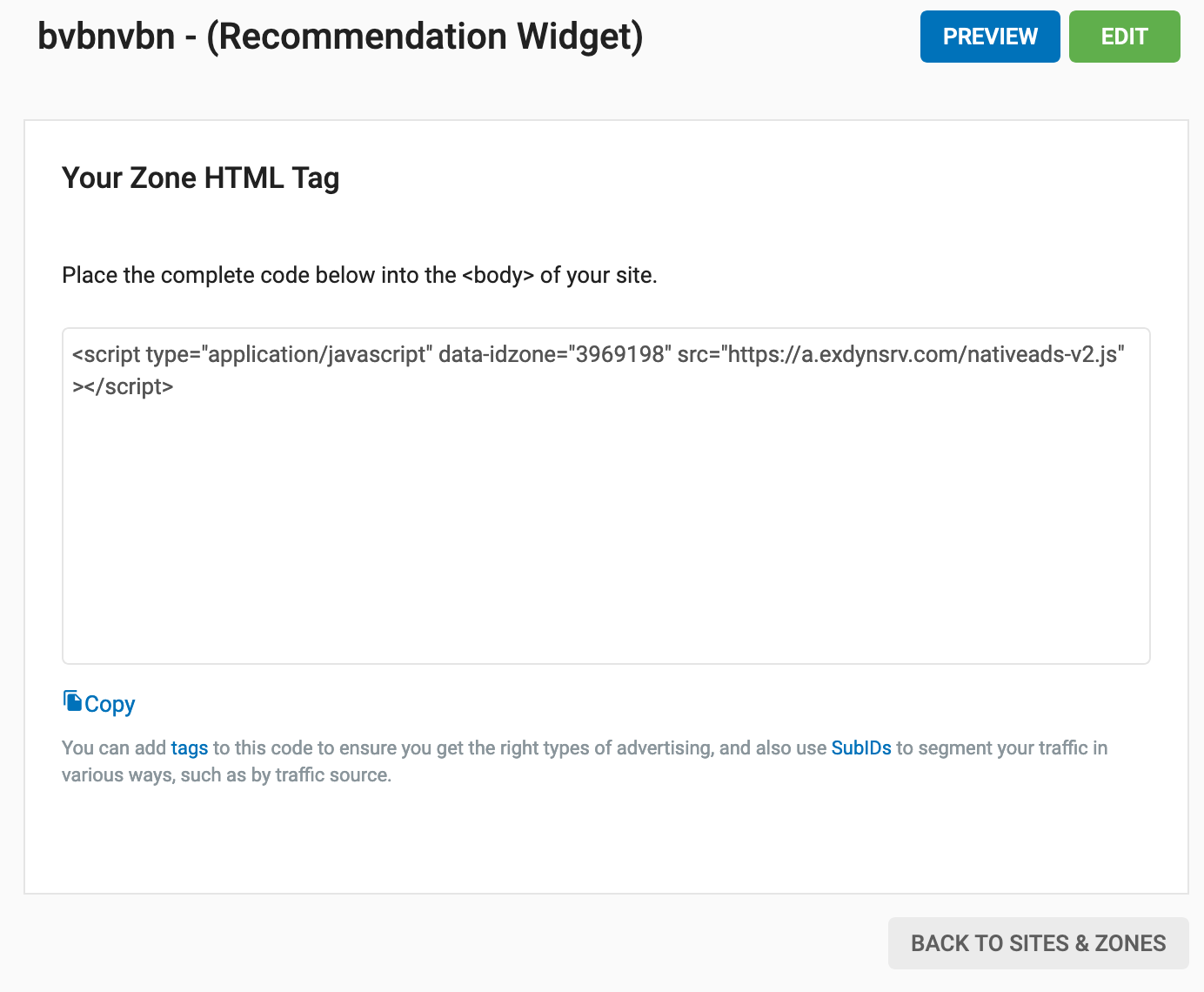
Copy the zone HTML Tag and add it to your site.
Conclusion
Try out the 3 scenarios to see which works best for you and here is some further Native Ad zone information.